Role
User Experience
& User Interface Design
Client
Mirror - Case Study
Project Length
1 month
Customer Base
International
THE BRIEF
During my course at Design Lab, students were provided with a brief for a fictitious retail company called Mirror. Mirror had a background as a longstanding clothing chain store, providing good quality low-cost clothing to the whole family since 1994. They have 400 stores in 32 countries. No e-commerce website and the same logo as when they first opened.
The obstacles for Mirror:
Losing customers to competitors with online stores
Options in physical stores are limited so customers buy elsewhere which results in their warehouses being full of stock that is difficult to shift
Outdated logo that could negatively impact brand image with younger customer base.
of online shoppers buy clothes in the UK (2022).
According to Cybercrew UK statistics

Mirror receives none of those transactions/income.

DISCOVER/RESEARCH
Goals of research:
Explore the main decision-making factors of the user when shopping online including what drives an individual to choose one online store over another to give our client a competitive edge on their responsive e-commerce site.
What's next?
Defining the research objectives and talking to users to understand their shopping habits.
Research objectives:
1. Examine the thought process before the user decides to go online to shop
2. Analyse customer decisions once online
3. Understand how customers interact with features online
4. Document users most positive and negative online experiences
Screening Survey
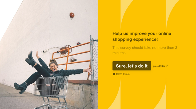
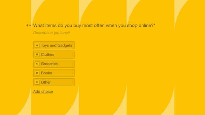
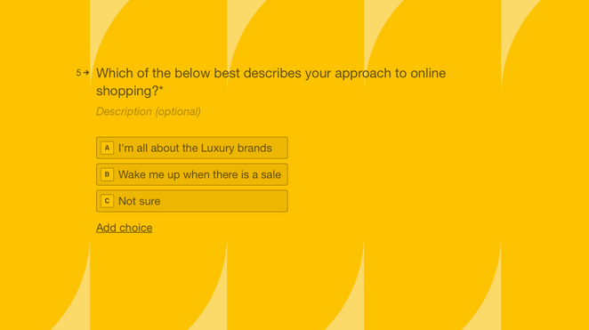
Finding the right customers. A screening survey was issued to ensure we find frequent online shoppers of clothes. It would be less helpful to interview someone who was not comfortable buying online and only bought gardening equipment when they shop online. Below are the screening questions. I used an application called Typeform to create the survey and distributed it via a virtual link.
User Interviews
I performed User Interviews with participants that had passed screening, exploring why they shopped online, what features they used and if there where external factors that contributed to their choices.
Remote Interviews: Selected a handful of participants to answer a few questions and observe them making a purchase from their favourite online store. Participants were required to share their screen so I could see how they navigated competitor websites.
Contextual Inquiry: To explore users preference to shop online in a particular physical environment.
Patterns
I found several behaviour patterns that all of the participants seemed to share:
I usually go for outfits I've seen elsewhere and not on the online shop itself
I usually buy clothes when there's a special occasion
I usually use a browser, signing up to or in and out of an App is a lot of commitment.
I like buying on my fav website because it's so easy! It's just a few clicks and you're done! The item is on its way.
The quality of the clothes for the price was paramount to how I feel about their overall experience of the online shop
Personas
From my research I identified two Personas. The 'No fuss shopper' and 'The browser'. 'The browsers' whilst not developed into a persona were considered throughout the process with regards to the filter options. Below is the Persona Leanne, a ' No fuss shopper'. The Persona was important to ensure the solution remained User -Centered.
No Fuss Shopper
-
Time orientated
-
Go for the Search bar
The Browser
-
Enjoy experience of selecting items
-
Uses filters to better view their options
 |
|---|
STRUCTURE & STYLE
STRUCTURE - Information Architecture
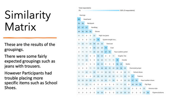
Card Sorting
Participants were requested to categorise a group of clothing items. This activity was completed remotely through a company called UXTweak.
Sitemaps
The previous card sorting activity helped to better understand the most common categories and typical language of the users. With this information I was able to confidently create the classification system for the site.
User Flow Diagram
I created a User story based on the Persona and mapped the customer journey to identify any weak points and keep the bounce rate low in the prototype test.
 User flow diagram for online shopping experience based on a User Story. |
|---|
Road Map
Several investigations where conducted in order to better understand the users of Mirror's websites. It was important to create a feature roadmap so that a design team would know the features to prioritise and those that could be worked on or added at a later date.
PROTOTYPE & TESTING
 |
|---|
The time frame for the project did not allow for me to build a complete website so instead Users were asked to complete the ideal User flow/Path of online shopping which is:
Find Item
Review
Add To Basket
Complete Checkout
Low Fidelity Prototype
As is the nature of the clothing industry, trends are constantly changing. The low fidelity prototypes had a modular design, so that sections could be maintained, updated and added to very easily in order to increase the longevity of the website.

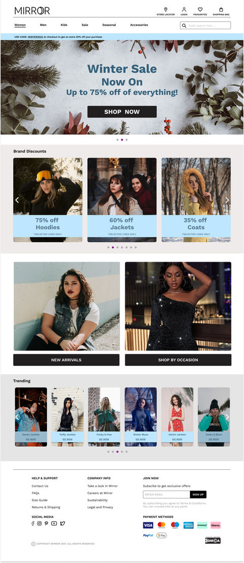
High Fidelity Prototype
These are the high fidelity prototypes of the Homepage for the desktop and mobile website. The feel and colours are influenced by the style guide and a winter 'seasonal' collection.
TESTING - Follow the Path
Mobile Testing
Once the high fidelity screens were complete, participants were asked to take part in the usability testing. I used an application called Maze to create User paths and heat maps for the tests.
Users (all female) were asked to complete a simple task during the interview.
This video is a walkthrough of the prototype and the Task.
User Task:
Buy a pink hoodie
SUMMARY
It was a very small group of Users but I received great feedback. None of the participants took the exact path that I outlined but in speaking to the Users that seems to be a good thing. They appeared 'positively' engaged by products and wanted to click on more elements than were fully functional in the prototype.

Mapping
I reviewed the Heat maps on Maze and put all of my findings in an Affinity Map so I could view all of the successes, pain points, patterns and necessary improvements at a glance.
Next Steps
1. Make alterations to touch points and other improvements outlined on the Affinity Map. and review the 'unexpected paths' used to complete the tasks by Mirror users Confirm if the 'path layout' is an issue i.e. unnatural to users or if there is something deeper to be explored.
2. Test prototype again in a larger group as an observational interview. Once the main kinks are worked out I would build out more of the prototype to include more flows and move onto remote testing in order to get a larger data response.
Thank you for reading
